Increasing easyHotel’s conversion rate by 33%
The problem
easyHotel wanted to increase the conversion rate of their website and app but weren’t quite sure on how to go about achieving that. As the sole designer on the project, I was tasked with seeing how much could be achieved by improving the design. Due to budget limitations on the project, the amount of time I had was very limited so I had to be very intentional and efficient with my chosen design activities.
Outcomes
- 33% increase in conversion rate (average across web and app).
- 6% reduction in checkout abandonments.
Research
Analytics analysis
To better understand how users were accessing the website and where the key problem areas were, I used Google Analytics to gather high level stats. I found that most users accessed the website using mobile devices and that the mobile experience converted worse than desktop. This led to the mobile experience being focused on as a priority moving forward.
Usability testing
I ran usability studies on the easyHotel website and app to identify key problem areas. I found that:
- Users struggled to find key bits of information about hotels and their room options which left users feeling uncertain about whether or not it was suitable for them and their trip.
- Pricing displayed in the checkout process was very unclear and left users confused about how much they’ll need to pay.
- Some users would leave the easyHotel experience to visit review sites in an attempt to find out what others thought of their stay. Some users would then get attracted to competitor hotels and fail to return.
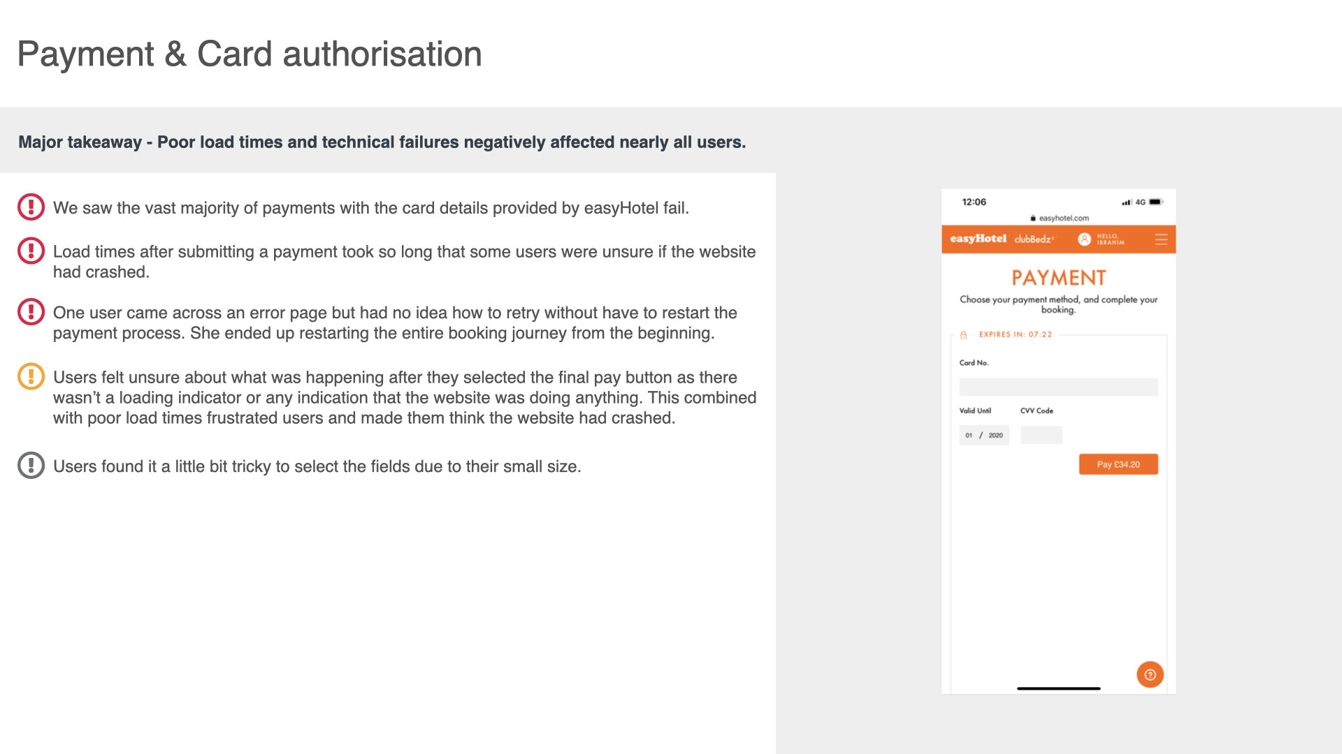
- Poor load times and technical errors had a huge negative impact on the experience.
I also ran studies on a variety competitor websites. This was useful as I could quickly see how alternative approaches worked with users, providing valuable insights for when I started creating designs.
It’s worth noting that findings were shared with stakeholders and the areas of improvement were agreed upon. This helped later on in the process when getting sign-off for updated designs as the rationale behind key changes were clearly understood.
Excerpt of the usability study report
Ideation
Improving the experience
Now that I had a clearer understanding of user pain-points, I began ideating. The process was very lean, with initial ideation taking place on paper and refinement of those ideas being done in Sketch (using the existing design language where possible). Key changes I made to the experience:
- Based on what I had identified as important to users and their decision making process, I added, removed, simplified and re-organised content on the hotel description pages.
- Focussed on making the options available to users and their prices much simpler to understand.
- Added Tripadvisor ratings and reviews to the hotel description pages so that users didn’t have to leave the easyHotel experience and potentially not come back.
- Fed-back technical errors to the development team to investigate and fix.
- More obvious tweaks such as implementing clearer and more consistent labelling and component behaviour across the easyHotel domain.
Updated hotel description page design
Usability testing
I created basic prototypes using Invision and then ran usability tests to see if my changes had made an impact. The new designs performed really well and addressed the key issues identified during the previous study. Users were able to make informed decision on the hotels they viewed and they were a lot more clear on what they were purchasing and what their costs were.
There were also a couple of improvement areas identified during this study which I was able to quickly take action on to further refine the experience.
Going live
Outcomes
The product team gradually released the designs changes during sprints and, once the bulk of the key changes had gone live, they saw a 33% increase in conversion rate (average across web and app) and a 6% reduction in checkout abandonments.
It’s worth noting that, due to the limited amount of time I had allocated to this project, I wasn’t able to review developments before they were released. If I had more time I’d certainly allocate it to this area. I believe that this lack of communication resulted in a higher amount of design bugs being released which I assume resulted in the changes not reaching their full potential.